What the Victorians did for us
The Victorian era was the age of invention, although the discovery of photography just pre-dates this with Ni�pce’s famous View from the Window at Le Gras in 1826. His early collaboration with Louis Daguerre led to the announcement of the daguerreotype in 1839 and its subsequent commercialization, alongside Talbot’s calotype. These early photos now appear very rudimentary alongside their modern film and digital counterparts, however it never ceases to amaze me with the ability of these early pioneers to push the limits of possibility. I wanted to highlight how two of these continue to have had profound impact.
Our recent fascination with 3D will most likely have come from the movies through the use of polarised glasses, although some of us may well remember using filtered red/blue glasses to view a dinosaur or shark in a kid’s magazine. However an understanding of binocular vision and exploiting this to view images in 3D (stereoscopy) goes back to Sir Charles Wheatstone in 1833 with his invention of the stereoscope.
Whilst Wheatstone used pencil drawings for his stereoscope, photography was the obvious companion for it and was immensely popular with a Victorian society eager to consume new technologies. Photographers experimented with stereo through the 1840s, however it was the Great Exhibition in 1851 that was the catalyst for its exposure to an international audience. Brian May’s (yes, that Brian May!) sumptuously illustrated photobook is a prime example (May, B. and Vidal, E. (2009) A Village Lost and Found, Frances Lincoln), showcasing T.R. Williams’ wonderful stereophotos of an undisclosed village. The book identifies the village as Hinton Waldrist in Oxfordshire, rephotographs the same scenes and includes a stereoscope (designed by Brian May). Viewing examples such as this demonstrates that there is something magical about stereo vision - it’s a window on ‘a world that was’ and we view it as if we were actually there.
The second, and at the time, unrelated technology was aerial photography. Whilst we might think of this being inextricably linked with the invention of the aircraft and its rapid development in the First World War, there had been a range of creative methods for lofting a camera off the ground. The very first aerial photo was taken by Nadar in 1858 and whilst this hasn’t survived, James Black’s 1860 photo of Boston does. It may look a little pass� now, however pause for a moment to consider what was involved. The 1850s saw the dominance of the collodion wet-plate process that produced a high quality negative on a glass plate. This had to be prepared on the spot as it was light sensitive only as long as it was wet and then needed to be developed straight after exposure. That meant Black had a full darkroom in his tethered balloon that was likely swaying 365m above the Boston streets. I don’t imagine there was a detailed risk assessment completed before the trip!
Probably the most successful alternative to balloons has been kites, with the first successful photo by Batut over Labruguiere, France, in 1888. However it is George Lawrence’s photos of San Francisco in the aftermath of the 1906 earthquake and fire that are astonishing (see below). He used up to 17 large kites to lift an enormous 22kg panoramic camera (my Nikon D700 with 70-200mm lens “only” weights 2.5kg!) with a 19” focal length and 20x48” plate. This was serious kite flying!
These Victorian inventions may seem distant now that stereoscopy is a key component in movie production, something movie-goers have become very familiar with. Aerial photography is equally important in map making and, when combined with stereoscopy, allow us to extract 3D features from the landscape. Kite photography is the direct ancestor of drones, a rapidly burgeoning area. Everything that was learnt about near-Earth imaging is now being re-learnt for a new generation.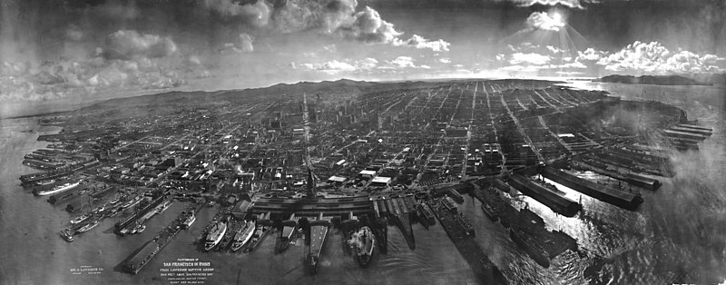
Windows 10 Anniversary Update
Well the Windows 10 Anniversary Update has landed and, after the big download, it comes with quite an array of tweaks and new features. To get the skinny on some of these head to your favourite IT site for their run down… for example cnet or How-to-Geek.
Perhaps the most interesting for techies out there is the arrival of a Linux Ubuntu subsytem. How-to-Geek has a great rundown for installation (and to note its not really Linux, as its the bash shell, so really GNU apps). Anyway, think of this as the reverse of WINE. Opens up a world of command line scripting.
And a final note on usability and interface. Yes, really yes, the start menu has changed AGAIN. Supposedly simpler, cleaner, nicer, fresher - pick your superlative. Except… usable?? My Mum went through the update, it all installed perfectly, no errors and then… she couldn’t work out how to shut down the machine. Sorry Microsoft, FAIL on that count.
Swiping in QGIS
I quite often find myself compare two images or a vector layer overlying a raster layer and, for me, a swiping tool is tremendously helpful in doing this. Its now also commonly deployed as a javascript tools in web browsers to compare before/after images as well. ERDAS Imagine has had such a function since the year dot. So it was disappointing to see that it isn’t natively part of QGIS - but heck, it is one of those nice-to-have bells and whistles. But actually, it turns out that the MapSwipeTool does just this - although its classed as an “experimental” plugin so you need to make sure these are loaded into the plugins (just change the plugin settings).
Once installed, select the swipe layer and start the plugin. This will then be revealed/hidden from the underlying layers.
Of VM woes…
Actually not so much VM woes as out-of-date underlying OS. Yes, the new term is hitting so I thought it appropriate to upgrade ArcGIS to the same version used on campus - that meant going from 10.2.1 to 10.4. Simples I thought - just request the student/instructor license, download the EXE and away we go.
Of course in reality things are never quite so simple. I won’t allow ArcGIS near my native OS because it is such a behemoth of an application - so I run it in a VM. Its slower, but locked down and if it dies, well I can just spin it up in the VM again. I use the excellent (and cross-platform) Portable VirtualBox) and, because its portable, I can copy it onto my portable hard drive and take it with (just make sure your drive is exFAT formatted for those large VDI files). Anyway, after the EXE download and install fails telling me to upgrade to Windows 7 (yes, the VM is on 7, I have an 8.1 and the main system on 10) to SP1. One upgrade later and…. upgrade .NET to 4.5+. And then… my virtual disk runs out of space. Its sized to 25Gb, but with ArcGIS, Imagine and Cyclone on there its run out of space. A little head scratching (and Googling later) led me to this page outlining the VirtualBox command to increase the VDI file (why you can’t do this in the GUI I don’t know!):
VBoxManage modifyhd windows7.vdi —resize 30000
Finally, inside Windows, expand the partition to take up all the virtual drive space.
Bingo, ArcGIS finally installs.
Whilst these are quite frustrating hoops to jump through, it does at least make you aware of some of the hurdles that students face.
Peer Review Week
Well the dust has settled on Peer Review Week, a low profile (!) event celebrating the moderating role of peer review scholarly communication. It’s good to see lots of high profile sponsors although a few notable gaps so I would encourage those organisations to get behind this initiative as it’s essential in all aspects of public life, working with government and communicating to the broader general public.
Sense About Science were active as part of their advocacy role of science in public life and its worth pointing to some of their resources for those that may have missed them last week:
I Don’t Know What to Believe: in their own words This leaflet is for people who follow debates about science and medicine in the news. It explains how scientists present and judge research and how you can ask questions of the scientific information presented to you.
Peer review: the nuts and bolts: a pamphlet target at early career researchers to make sense of the whole academic publishing scene.
And for those ECRs wanting some hands on guidance then go along to the next Peer Review Workshop.
Give a beep…
Give a beep is a great example of citizen science, geographically volunteered information and the ability of everyday “users” to influence politicians. Cycling is big in London - very big. Wikipedia shows the number of journeys per day doubling between 1999 and 2014 (over 600,000) with the ratio of cars to bikes dropping from 17:1 to 1.7:1 by 2016. Cycling is quicker, cheaper, healthier… and enjoyable. Why drive? Well, one aspect is safety. As Wikipedia again show, recorded accidents have dropped for the first time in 2014 and whilst relatively low the fear of an accident is a big part of this.
Enter Hovding (yes, those of bike airbag fame), ably assisted by the London Cycling Campaign, have teamed up to find out where and when people feel unsafe. Using the low cost, low power, Flic (how many uses can you think of for this little puppy?!), mount it on your bike, pair the low-power Bluetooth button with you phone and then, every time you hit the button it sends an email to the Mayor of London with you location and time. And, by also storing that information online they produced an interactive map of “fear”.
OK, the mapping is nothing to shout home about (seriously Hovding…. can we move away from the yellow meme??) but the simplicity of use and application to a real world issue where cyclists can genuinely feedback in to policy is great.
After the initial trial of 500 users is being rolled out to anyone wanting to use it - just buy a flic and give-a-beep (how long before every taxi has a jump-the-light flic for reporting cyclists!!).
Got an old ISO disc image….
…. as I have. I was interested in accessing the contents of an old ISO disc image from an age old data CD. There are a number of tools to look inside these, but at times you just want to emulate a CD/DVD drive and run it directly. There are a range of tools to do this but I wondered if there was an easy option… and there is! Under Windows 10 you can now directly “Mount” the ISO image and it will appear as a new CD-ROM on your PC. Just right-click and “Mount.” For older systems Microsoft do a device driver bundled as the Microsoft Virtual CDRom Control Panel (which I first came across here).
Voila! Problem solved.
Tour of Britain: at 240fps!

We moved to a couple of different positions over the course of the 16 laps and Ryan shot some hyperlapse (240fps high frame rate) on his iPhone. High frame rates are great fun with some models pushing 1000fps which is pretty amazing. Anyway, see the video below and watch the start carefully to see how fast they are really going!
Don’t just fly a drone… BE THE DRONE!
We’ve long been able to view remote video footage from a remote camera - when I was developing the kite aerial photography workflow I currently use, I experimented with a small spy camera that transmitted video footage back to an analogue LCD TV. It worked quite well and the intention was to use it to determine camera attitude and so allow use to remotely rotate the camera. Except for one BIG problem - when you are imaging the natural environment from relatively close range (60m), one piece of grass looks EXACTLY like another!!! In the end it was a pointless exercise.
Anyway, things move on and the next obvious way to integrate video was via AR (augmented reality) through a video overly in glasses. And true to form, DJI have announced another tie up, this time with Epson and their Moverio BT-300. See the announcement and some commentary on it over at DPReview. For consumer drones these make more sense as you tend to be viewing obliquely from (very) close range so positioning is important. Of course the glasses cost as much as the drone (!) but expect these products to become more prevalent.
OS from the air
A nice piece over at the BBC on informal photos taken by Ordnance Survey’s aerial unit whilst surveying. And the accompanying video. Grand stuff!
Historic London Underground
I was at the London Transport Museum in Covent Garden recently and saw a nice animation of the historical development of the network. With all the underground mania in mapping, I liked this because it’s one you see much less often and provides a nice historical perspective on the growth (and decline) on parts of the network. I couldn’t find the animation that TfL used, but did come across the site of graphic designer Doug Rose who has produced a similar animation. So click here to view the map itself which (unfortunately!) uses Flash video. Quite fascinating.
Studio of Objects at RGS
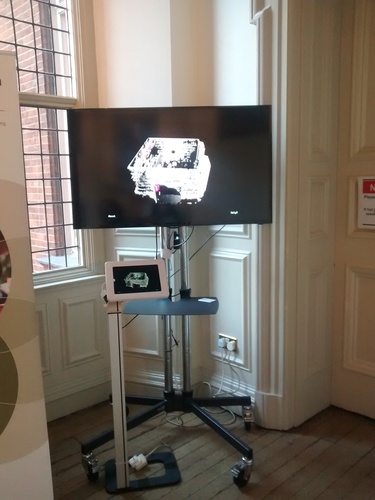 The Studio of Objects (see all my previous posts on the project), which recorded the interior space of Paolozzi’s studio at the Scottish National Gallery, was available for viewing and interaction at the Royal Geographical Society Annual Conference last week in London.
I took part in a panel discussion on the arts and sciences (see my personal page for slides and mp3) and then for the rest of the day the latest beta version was available in the main hall. In fact, the installation was so popular that it made a return visit on Friday where delegates had a second bite at the interactive cherry!
Reading Landscape :: art production by Fine Art and Geography Students, Kingston University
And following on from our “Reading Landscape” project I blogged about last week, here is the video out we presented for the first time at the RGS-IBG Annual Conference last week.
Be sure to check out Patrick Rickles blog post outlining the session and with a picture of all the presenters (including our fab students). And, to quote Patrick:
The next talk was from Mike Smith, Flora Parrott and their students from Kingston University on interdisciplinary ways of perceiving space. Flora, with a background in Fine Arts and Mike, coming from Remote Sensing, brought their students together to phenomenologically explore the Rotherhithe Tunnel - once dubbed the 8th wonder of the world, which was the first of it’s kind to allow people to cross under the Thames. Students used Go Pro cameras, castings of the tunnel and 3D imaging techniques to collect experiential information of the tunnel to create a narrative from the students. One of their outputs was an incredible video sharing the students’ experiences titled “Reading Landscape”.
Check out the slides below (and on my personal page).
With many thanks to all who participated and in particular the dedication of the students who participated. It’s been an amazing cross-fertilization of creative ideas. Enjoy!
<
iframe id=”viewer” src = “/Viewer.js/#../blosxom/documents/Smith_2016_Reading_Landscape.pdf” width=’556’ height=’400’ allowfullscreen webkitallowfullscreen>
Holocene Book Review: Emanuela Casti, Reflexive Cartography: A New Perspective in Mapping
Mike J. Smith (2016)
The Holocene
Elsevier’s Modern Cartography Series, edited by Professor DR Fraser Taylor, is a long-running occasional series that currently comprises seven volumes, the first published in 1991. With a hia-tus since 2006, Elsevier has injected some new vigour with a title planned for 2017 and this volume, Reflexive Cartography, pub-lished in 2015.